Tips To Write Copy for High-Converting Landing Pages In Dubai
Did you know that a well-crafted landing page in 2026 can convert around 1 in 10 visitors? That’s a big deal, especially given how crowded and competitive the digital landscape has become. But here’s the nuance: hitting that 10% isn’t just about flashy design or polished wording – it’s about truly understanding your audience and guiding them seamlessly toward that one action you want them to take.
The best landing pages are laser-focused on a single call-to-action (CTA). As a copywriter, your job is to spark the right emotions – so visitors feel like your product or service is exactly what they’ve been searching for.
In this blog, we’ll break down what makes a landing page work, clear up common myths, and walk you through each section – showing you how to turn casual visitors into eager customers, fast.
Before we dive in, let’s get clear on what a landing page actually does – and bust two of the biggest myths people still believe in 2026.
What is the Purpose of a Landing Page?
Landing pages are focused web pages built for one reason: to get visitors to take a specific action. That might be signing up, booking a demo, or grabbing a free download – whatever your goal, the landing page is the launchpad.
Think of landing pages as a friendly handshake – they offer something valuable (like a product demo, free e-book, or early access) in exchange for details like an email or phone number. It’s a win-win.
They’re also where you spotlight benefits and features that nudge your visitors toward saying yes.
Whatever your conversion goal, make sure every bit of copy – and every call-to-action – lines up with exactly what you want visitors to do.
Common Misconceptions About Landing Pages
Let’s clear up a few myths that still trip up even experienced marketers in 2026.
1. “A Landing Page Is Just a Homepage in Disguise”
Not even close! Your homepage is like the lobby of a hotel – inviting, full of information, and designed to help people explore all that you offer. Your landing page? Think of it as a direct elevator to one penthouse suite. It’s focused on a single goal, with zero distractions.
Example:
A Dubai-based SaaS startup runs a paid ad for its new AI-driven scheduling tool. The ad links to a landing page offering a free trial – no menu, no blog links, just the product benefits and a clear sign-up form. That’s nothing like their main homepage, which showcases all their products and company news.
2. “You Can Combine Multiple Offers on One Landing Page”
Tempting, but a one-way ticket to lower conversions. In 2026, users want clarity and speed. If you toss in too many choices (“Book a demo, download our whitepaper, or join our newsletter!”), visitors get overwhelmed and bail out.
Example:
Imagine you’re searching for the best fitness tracker. You land on a page that offers a product demo, a discount code, and a webinar sign-up – all at once. It’s confusing! But if the landing page is dedicated just to the “Try Our Tracker Free for 30 Days” offer, you know exactly what to do.
3. “Every Landing Page Needs to Be Packed With Features and Details”
Nope. People skim, especially on mobile. The best landing pages in 2026 are all about clear benefits and memorable headlines. Save the nitty-gritty for your product pages or follow-up emails.
Example:
A fintech app’s landing page quickly explains “Send money globally in seconds with zero fees.” That’s it – no lengthy specs or technical charts. The details come after sign-up.
Crucial Factors To Remember While Writing Copy For Landing Pages
Writing a landing page copy in 2026 is about connecting quickly, guiding visitors smoothly, and making action feel irresistible. Here’s how to nail it:
1. Keep It Laser-Focused
Don’t try to do everything at once. Your landing page has one job: drive a single action. Strip away anything that doesn’t support that goal.
Example:
If you’re promoting a new AI-driven marketing tool, your whole page should guide people to “Book a Free Demo” – not also push newsletter signups or unrelated products.
2. Match the Message to the Ad
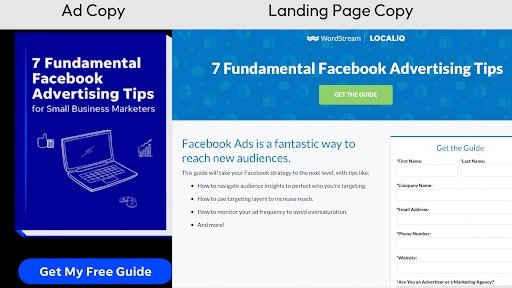
When people click an ad or email, they expect to land somewhere that makes sense. If your landing page doesn’t match the promise of your ad, you’ll lose trust in seconds.
Example:
A paid Instagram ad offers “50% off your first month.” The landing page headline should repeat that exact offer, not surprise visitors with something different.
3. Show the Benefit – Not Just Features
Features are what your product does, but benefits are how it makes your visitor’s life better. In 2026, attention spans are shorter than ever, so lead with outcomes.
Example:
Instead of “Real-time analytics dashboard,” say, “See results instantly and make smarter decisions on the fly.”
4. Make It Skimmable
People scan, especially on mobile. Use short paragraphs, bullet points, and bold text to highlight the essentials. Don’t bury your best lines in big blocks of text.
Example:
- Instant onboarding (start in 2 minutes)
- Transparent pricing (no hidden fees)
- 24/7 live chat support
5. Build Trust Instantly
Social proof is your secret weapon in 2026. Sprinkle in testimonials, customer logos, or quick stats to show real people trust you.
Example:
“Trusted by 4,000+ Dubai businesses in 2026” or a short quote from a satisfied customer.
6. Use Clear, Action-Oriented CTAs
Don’t make visitors guess what to do next. Use buttons that say exactly what happens: “Start My Free Trial,” “Get My Quote,” or “Book My Demo.”
7. Sound Like a Human
Ditch the jargon and robot-speak. Imagine you’re explaining your offer to a friend over coffee. Use “you” and “your” to make it personal.
Example:
“Ready to get rid of manual scheduling headaches? We’ll handle it – so you can focus on what matters.”
LOOKING FOR LANDING PAGE OPTIMIZATION? GET IN TOUCH WITH US
What are the different parts of a Landing Page?
Understanding how a landing page is built makes writing great copy so much easier. Think of it as your blueprint – each part plays a role in getting visitors to take action. Let’s break it down in plain terms for 2026.
Most high-performing landing pages in 2026 include these sections:
- Hero Section
- Form Field
- Benefits
- Features
- Social Proof
- Call To Action
Let’s look at each of these elements in a new light.
Hero Section
The hero section is the first thing visitors see – your shot at a great first impression. This is where you grab attention and give people a reason to keep scrolling.
Your hero section needs three things: a catchy headline, a short supporting line, and a clear button (your CTA).
Make sure your headline, subheadline, and CTA all spotlight exactly what makes your offer unique. Be bold – say why you’re different, right up front.
Take Netflix for Example:
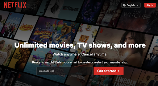
Think about how Netflix does it. When you land on their homepage, you’re greeted with a headline like, “Unlimited movies, TV shows, and more. Watch anywhere. Cancel anytime.” It’s simple, direct, and instantly tells you what you get – no fluff, no jargon. The supporting line reassures you (“Ready to watch? Enter your email to create or restart your membership.”), and the call-to-action button is hard to miss.
Why does this work so well in 2026?
People want to know what’s in it for them, fast. Netflix leads with benefits (“Unlimited movies, TV shows, and more”), not just features. The messaging is all about the experience, not technical specs or complicated sign-up processes.
How to Apply This to Your Landing Page:
- Headline: Make it clear and benefit-driven. For example, if you’re launching a new AI-powered personal finance app in Dubai, try: “Take control of your money – automatically save, invest & track spending, all in one place.”
- Supporting Line: Address hesitations or explain how easy it is. “Start in 60 seconds. No credit card required. Full privacy control – always.”
- CTA Button: Use action words that tell visitors what to do next. “Start Saving Free” or “Try AI Finance Now.”
Pro tip:
Don’t overcomplicate things. Visitors in 2026 are used to fast, seamless digital experiences. The easier and more obvious you make the next step, the more likely they are to take it.
2)Form Field:
The form field is where the magic happens – this is how you turn visitors into leads. In 2026, people value their time and privacy, so keep it short and sweet. Just ask for what you really need (usually just a name and email).
If your form is longer than a coffee order, it’s too long. One or two fields is usually enough to get the conversation started.
3) Benefits: Show People What’s In It for Them
In 2026, nobody has time to read through a wall of features – they want to know, right away, how your product will make their life easier, better, or more exciting. That’s why the benefits section on your landing page is where you really connect with your visitors.
Lead With Outcomes, Not Just Specs
Don’t just list features like “AI-powered dashboard” or “24/7 support.” Instead, paint a picture of what those features actually do for your user.
Example:
Instead of:
- “Advanced analytics platform with real-time updates.”
Try:
- “Spot business opportunities instantly and get ahead of competitors with real-time insights.”
Speak to Their Aspirations and Pain Points
Think about what your audience wants and what frustrates them. Show how your product bridges that gap.
Example:
If you’re marketing a remote team management tool for 2026, don’t just say “Integrated video chat.” Instead, use:
- “Run seamless meetings with your hybrid team – no tech headaches, no dropped calls.”
Use Simple, Relatable Language
Avoid technical jargon whenever possible. Use examples your audience will recognize from their everyday lives.
Example:
For a personal finance app:
- “Save money without thinking – our smart AI moves spare change into your savings automatically, so you can hit your goals faster.”
Make It Skimmable
Use bullet points, bold important phrases, and keep sentences short. People will scan before they read.
Example:
- Get set up in 2 minutes – no learning curve
- See all your expenses at a glance
- Automatic reminders so you never miss a bill
Add Social Proof When Possible
Show that real people have experienced these benefits. A quick testimonial or a stat (“Trusted by 5,000+ Dubai professionals in 2026”) can go a long way.
Bottom line:
Your benefits section isn’t about what your product does – it’s about what your customer gets. Make it easy for them to picture enjoying the results, and they’ll be much more likely to click that CTA.
How Netflix Nails Benefit-Driven Features
Let’s break down why Netflix’s features section works so well – and how you can use the same approach:
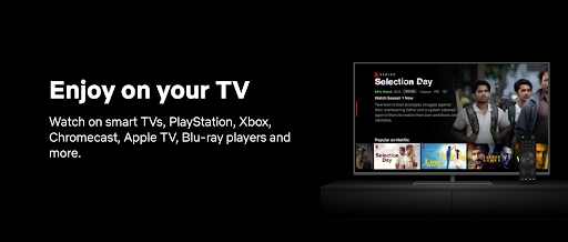
1. Simplicity Wins
Netflix doesn’t overcomplicate things. The heading is crystal clear: “Watch on your TV.” No industry jargon, just a direct answer to what people actually want – to enjoy their favorite shows on the big screen.
2. Make It Personal
Netflix uses “your” to make the message feel like it’s tailored just for you. It’s not about any TV – it’s about your TV, your setup, your experience. This instantly creates a sense of ownership and connection.
3. Show Real-World Compatibility
Instead of just saying “works everywhere,” Netflix lists the actual devices: smart TVs, PlayStation, Xbox, Chromecast, Apple TV, and more. This isn’t just a technical flex – it’s practical reassurance that you can start watching right away, no matter what gear you have at home.
4. User-Centric, Not Tech-Centric
By mentioning devices people already use for entertainment, Netflix shows they’ve built their service around real habits – not around features for their own sake. It feels like they’ve thought about your convenience from the start.
5. Highlight Added Value
Netflix doesn’t just say you can watch on your phone or laptop. They make it clear your subscription unlocks a world of entertainment on every screen in your house, making your experience richer and more flexible.
Bottom line:
Netflix’s approach is a masterclass in benefit-driven features: simple, personal, and rooted in real user needs. When you write your own features section, focus on how each feature makes your customer’s life easier or better – and use examples from their everyday world, just like Netflix does.
In summary, by focusing on the benefits on your landing page, you make your message more customer-centric, emotionally engaging, and relatable.
Features: Highlight What Makes You Stand Out
Once your visitors are excited about the benefits, it’s time to show them what’s under the hood. The features section is where you reassure people that you’ve got the tech, the details, and the know-how to back up your promises.
1.Keep It Clear and Relatable
Remember, people want to know what your product can actually do for them – not just a list of technical specs.
Example:
Instead of:
- “Multi-factor authentication and biometric login”
Try:
- “Your data stays safe with your fingerprint and face ID – no more forgotten passwords.”
2.Connect Features to Everyday Life
Don’t just tell people you have a feature – show them why it matters.
Example:
If you’re offering an AI-powered scheduling tool:
- “Our smart calendar finds the best meeting times for your whole team – no more back-and-forth emails.”
3.Use Micro-Explanations
A quick, friendly explanation after each feature helps visitors understand its value instantly.
Example:
- Instant Notifications: Get alerts on your phone as soon as something important happens – so you’re always in the loop, even on the go.
- One-Click Reports: Download a summary of your expenses in seconds – perfect for tax time.
4.Make It Easy to Scan
Use short bullet points, bold feature names, and simple icons if possible. People are often skimming for what matters most to them.
Example:
- 24/7 Support: Real humans, ready to help anytime
- Seamless Integrations: Works with WhatsApp, Google Calendar, and Zoom
- Customizable Dashboard: See what matters to you, front and center
5.Keep It Up-To-Date
Highlight any features that are brand new or especially relevant for 2026. Show visitors you’re ahead of the curve.
Example:
- AI-Powered Insights (New for 2026): Get personalized suggestions to boost your productivity every morning.
Bottom line:
Your features section shouldn’t feel like reading a tech manual. Make it inviting, easy to understand, and always tie back to how each feature helps your audience win.
5) Social Proof: Build Instant Trust
In 2026, trust is the fastest way to turn a curious visitor into a loyal customer. People want to see real evidence that your product works and that others like them have already taken the leap.
a)Show Real People, Not Just Big Numbers
Star ratings and user counts are great, but genuine testimonials and customer stories are even better. Let your happy users do the talking.
Example:
Instead of a generic line like “Loved by thousands,” try:
- “Thanks to this app, I cut my monthly budgeting time in half – now I actually enjoy tracking my spending!” – Fatima, Dubai
6)Use Recognizable Logos and Partners
If you work with well-known brands or local leaders, display their logos. It gives instant credibility, especially if your audience recognizes them.
Example:
“Trusted by teams at Emirates, Careem, and 5,000+ Dubai businesses.”
c)Highlight Awards or Relevant Press
If you’ve been featured in major media or won industry awards, don’t be shy! A quick “As seen in Gulf News” or “Winner: 2026 MENA Startup of the Year” badge can tip the scales.
d)Make Social Proof Easy to Spot
Don’t bury testimonials at the bottom. Place them close to your call-to-action, or sprinkle them throughout the page so people see proof right when they need a confidence boost.
e)Use Relevant, Recent Examples
The world moves fast – so use testimonials and stats from 2026 or as close as possible. Show that your product is current and trusted right now.
Bottom line:
Social proof is your shortcut to credibility. When visitors see that people like them have already succeeded with your product, the leap to “I want that too” feels a lot smaller.
Call to Action (CTA): Make the Next Step Irresistible
Your CTA is where all your hard work pays off. It’s the moment your visitor decides to act – or bounces. In 2026, attention spans are shorter than ever, so your CTA needs to be ultra-clear, action-oriented, and impossible to miss.
1)Be Direct and Specific
Skip vague phrases like “Submit” or “Click Here.” Tell people exactly what’s going to happen when they click.
Examples:
- “Start My Free Trial”
- “Get My Instant Quote”
- “Book My Demo Today”
- “Unlock Early Access Now”
2)Make It Feel Personal
Use language that speaks directly to your visitor, making them feel like the experience is tailored just for them.
Example:
Instead of “Download,” try “Send My Guide” or “Show Me How It Works.”
3)Remove Friction and Address Hesitation
Reassure visitors right near the button. If there’s no risk or commitment, say so!
Examples:
- “No credit card needed”
- “Cancel anytime”
- “Takes less than 2 minutes”
4)Use Design to Make It Pop
Your CTA button should stand out – use a bold color, make it big enough, and leave plenty of white space around it. Don’t let it blend in with the rest of the page.
5)Place It Strategically
Don’t rely on a single CTA at the bottom. Sprinkle call-to-action buttons in key places – after you’ve explained the benefits, shown off the features, or shared a glowing testimonial.
Bottom line:
A clear, compelling CTA is the final nudge your visitors need. Make the next step obvious, easy, and rewarding, and you’ll see your conversion rates soar in 2026.
Take Away
Remember, every section on your page should work together to answer one big question for your visitor: “What’s in it for me?”
From a punchy headline and benefit-driven copy to real social proof, standout features, and a bold CTA, every word should make saying “yes” feel easy.
Landing page trends might evolve, but human nature doesn’t change: People want to feel understood, reassured, and empowered to take action. If your copy delivers that, you’ll always be ahead of the curve.
Want a hand applying these principles to your own landing page? We are here to help with strategy, copy, or anything in between. Directly WhatsApp CrèmeContent at +971544259710
